Adoption
Track organization-wide AI adoption trends — active users, cost evolution, provider distribution, and top models by spend.
The Adoption report gives you a high-level picture of how AI usage is growing across your organization. It tracks active users, total cost, and request volume over time — then breaks those numbers down by provider, model, and harness.
This page is designed for engineering leadership and finance teams who need to answer questions like: Is our AI investment paying off? Which providers drive the most cost? Are developers actually using the tools we've rolled out?
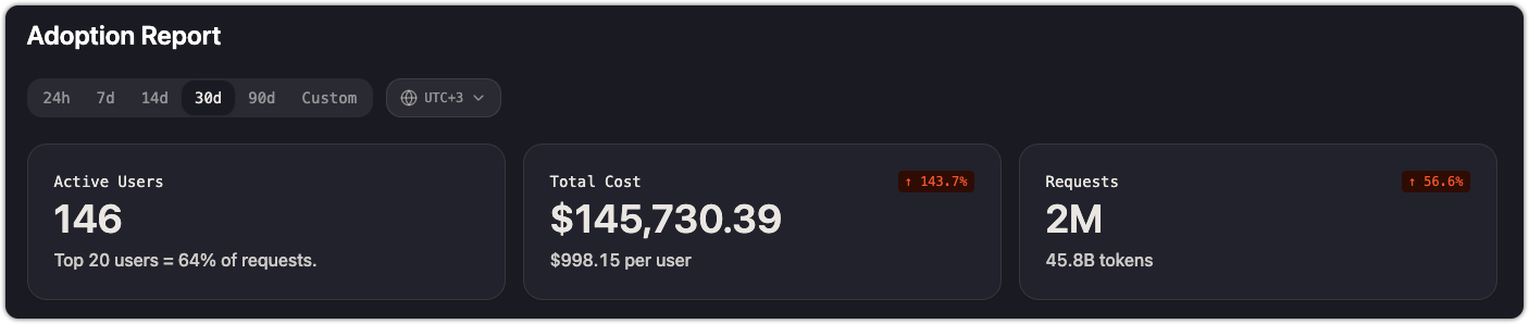
KPI cards
Three summary cards appear at the top of the page:
| Card | What it shows |
|---|---|
| Active Users | Number of distinct users who made at least one request in the selected time range. A secondary line shows what fraction of requests comes from the top 20 users. |
| Total Cost | Aggregate spend across all providers and models, with cost per user and total token count. A trend indicator shows change vs. the previous period. |
| Requests | Total number of API requests in the selected time range, with a trend indicator. |
Time range and timezone
Use the time range selector at the top of the page to choose a window: 24h, 7d, 14d, 30d, 90d, or Custom. All charts and cards update to reflect the selected range.
The timezone picker (next to the time range selector) controls how daily boundaries are drawn in the charts. Set it to your team's working timezone for the most meaningful daily aggregations.
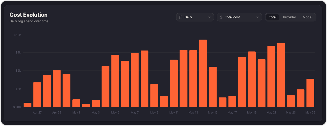
Cost evolution
A bar chart showing daily organization spend over the selected time range. Use it to spot spending spikes, track the impact of new model rollouts, and verify that cost trends align with usage growth.
The chart supports three breakdown modes:
- Total — aggregate cost per day
- Provider — cost split by provider (Anthropic, Kimchi, OpenAI, Gemini, etc.)
- Model — cost split by individual model
A secondary dropdown lets you switch between Total cost and Avg cost per user to normalize spend against headcount, as it divides the total daily cost per number of users.
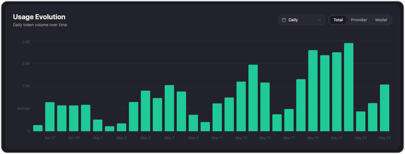
Usage evolution
A bar chart showing daily token volume. Like Cost evolution, it supports Total, Provider, and Model breakdowns and can be toggled between Daily and cumulative views.
Use this alongside Cost evolution to understand whether cost increases are driven by more users, more requests, or a shift toward more expensive models.
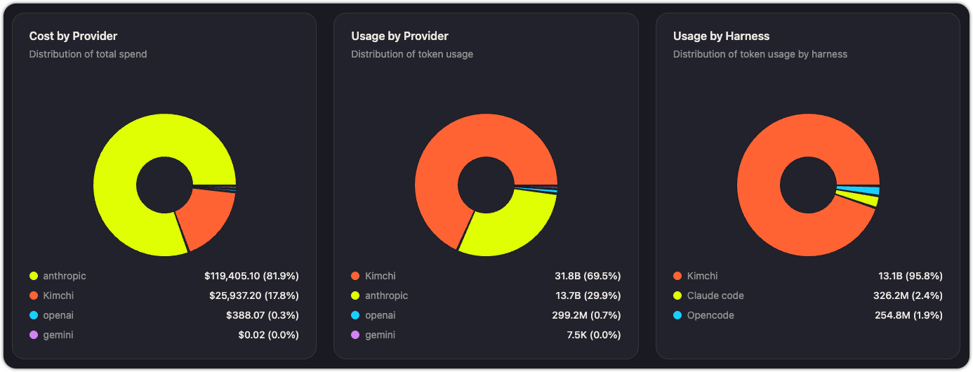
Distribution
Three pie charts show how cost and usage are distributed:
| Chart | What it shows | Example insight |
|---|---|---|
| Cost by Provider | Percentage of total spend going to each provider | "82% of our spend goes to Anthropic — should we shift more traffic to Kimchi Inference?" |
| Usage by Provider | Percentage of total token volume by provider | "Kimchi handles 69% of our token volume but only 17% of cost — it's our most cost-efficient provider." |
| Usage by Harness | Percentage of token volume by harness (Kimchi, Claude Code, OpenCode, etc.) | "95% of tokens flow through Kimchi — only 2.4% through Claude Code. We may have low OTel adoption." |
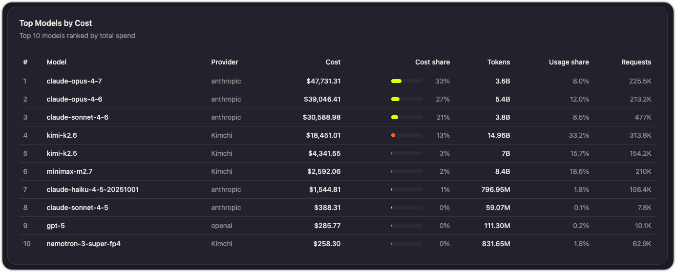
Top models by cost
A ranked table showing the 10 most expensive models by total spend. Each row shows the model name and its total cost over the selected time range.
Use this to identify models that drive disproportionate cost. If a model appears at the top but isn't critical to your workflows, consider routing lower-priority traffic to a cheaper alternative.
Practical uses
- Justify AI investment: show leadership a 30-day or 90-day Adoption report to demonstrate active user growth and usage trends.
- Spot adoption gaps: if the Usage by Harness chart shows suspiciously low Claude Code or OpenCode activity, your OTel setup may not be reaching all developers. See Report coding tool metrics to Kimchi.
- Optimize provider mix: compare Cost by Provider against Usage by Provider to find the most cost-efficient routing.
- Forecast spend: use Cost evolution trends to project next month's budget.
See also
Updated about 1 month ago