Usage
Track AI usage by team or by user — requests, tokens, cost, model preferences, and trend data.
The Usage page shows who is consuming AI resources and how much it costs. You can view data aggregated by team or drilled down to individual users. Both views include the same core metrics — requests, tokens, cost — but at different levels of granularity.
This page is designed for team leads who need to understand their team's AI consumption, and for engineering managers who want to compare usage patterns across teams or identify individual cost outliers.
Views
Two toggle buttons at the top of the page switch between:
- By user — shows individual users, each with their team affiliation
- By team — shows aggregated metrics per team
The rest of the page — KPI cards, charts, and breakdown table — updates to reflect the selected view.
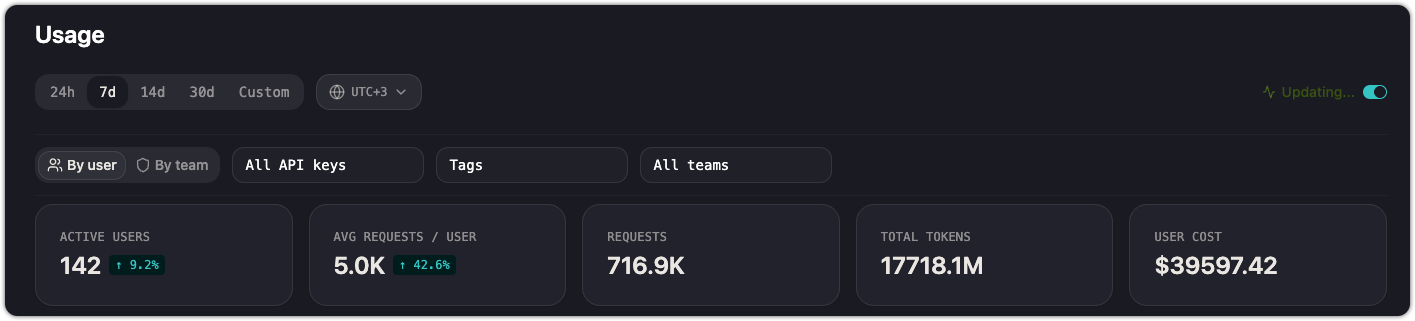
Filters
Both views share a set of filters below the view toggle:
| Filter | What it does |
|---|---|
| Time range | Select a window: 24h, 7d, 14d, 30d, or Custom. |
| API keys | Filter to requests made with specific API keys. Defaults to all keys. |
| Tags | Filter by tags attached to requests. |
| Teams | Filter to specific teams (available in both views — in the user view, this filters to users belonging to the selected teams). |
Live Mode
Toggle Live Mode on to auto-refresh the page as new requests arrive. The data updates continuously without a manual page reload. Turn it off when you need a stable snapshot for reporting or screenshots.
KPI cards
Four summary cards appear at the top:
| Card | What it shows |
|---|---|
| Active Users | Distinct users who made at least one request in the selected range |
| Avg Requests / User | Total requests divided by active users |
| Requests | Total API requests |
| Total Tokens | Sum of input and output tokens across all requests |
| User Cost | Total cost attributed to the filtered user set |
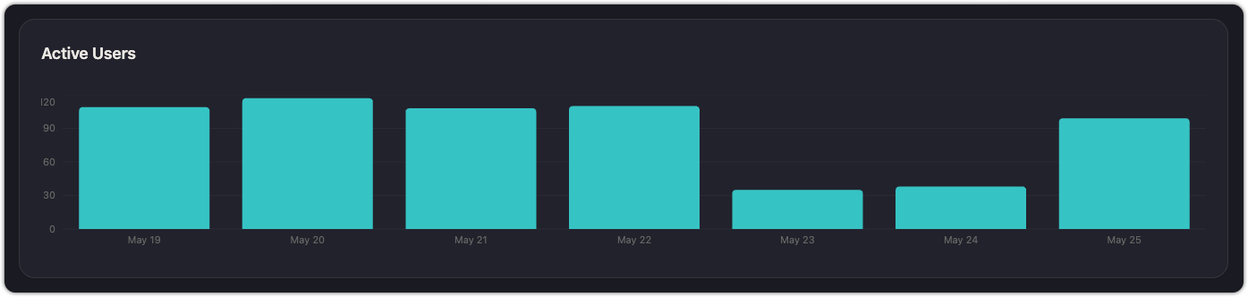
Activity chart
A bar chart visualizes activity over the selected time range:
- By user: shows the count of active users per day, giving you a sense of daily engagement.
- By team: shows a stacked bar chart colored by team, so you can see which teams drive the most traffic on any given day.
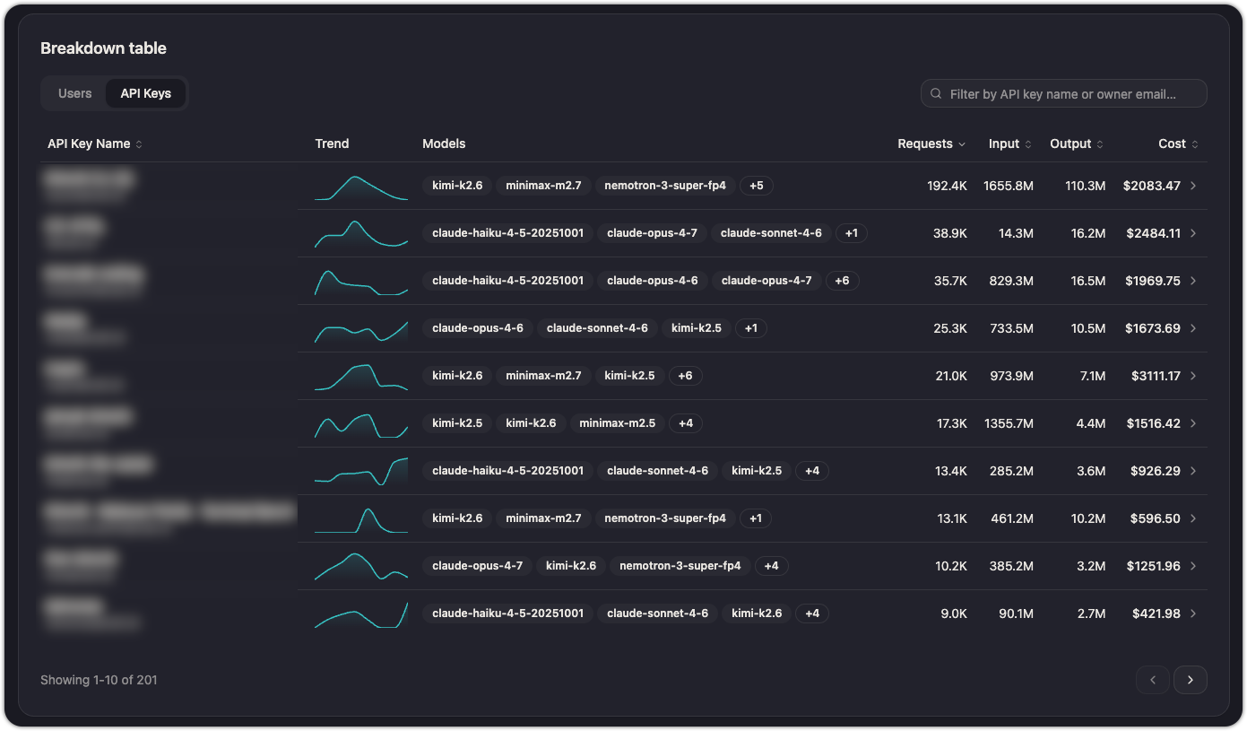
Breakdown
The table at the bottom of the page provides the detail. Each row represents a user or team, depending on the selected view.
| Column | Description |
|---|---|
| User Name | Name and email. A colored badge shows the user's team. |
| Trend | Sparkline showing request volume over the selected time range. |
| Models | List of models the user has called, with a "+N" overflow indicator if more than three. |
| Requests | Total request count. Sortable. |
| Input | Total input tokens. Sortable. |
| Output | Total output tokens. Sortable. |
| Cost | Total cost. Sortable. |
Click any column header to sort. Use the search box above the table to filter by name or email (user view) or team name (team view).
Practical uses
- Track per-team spend: switch to the team view, set a 30d range, and sort by Cost to see which teams drive the most spend. Share this with finance or leadership to allocate AI budgets.
- Identify heavy consumers: in the user view, sort by Requests or Cost to find individuals with outsized usage. This isn't about policing — it often reveals power users whose workflows could inform best practices for the rest of the team.
- Compare model preferences: the Models column shows which models each team or user gravitates toward. If one team relies heavily on an expensive model, consider whether a cheaper alternative would serve them just as well.
- Catch anomalies: a sudden spike in a user's trend sparkline may indicate a runaway script or misconfigured agent. Live Mode makes it easy to spot these in real time.
See also
Updated about 2 months ago